Representation of Space, Information, and Design Interventions
Since visual
communication/storytelling is such an important issue in the representation of
space, my plan to find and select examples involved Googling ‘award winning
urban design presentations’, choosing the first project from images that
visually grabs my attention, and then analyzing why it drew my attention. Not a very scientific or scholarly method but
effective for this assignment (and fun because by this time in the semester I
need something fun). All of the chosen
projects are student work (not built).
This is the
first project example and description (qt’d from web site velo-city2013.com)
“Implementing
Vienna’s cycle way network: during the winter semester 2012/2013, the Department of Landscape Planning and Garden Design and IVV TU Wien (Research Center of Transport
Planning and Traffic Engineering of Vienna University of Technology) organized
a practice-oriented design course for students of architecture, civil
engineering and spatial planning with a focus on continuing the cycle way along
the Wien River bed.”
It is not a
particularly good example for this assignment with just a few simple diagrams,
maps, images, and minimal text. Nevertheless, it is very easy to ‘read’ the
story visually from the images and icons and understand the project despite not
being able to read the text. There is a good amount of white space around the
images in the center which allows one to focus on the most important aspects –
the proposed route and public sites - and then move to the supporting details –
diagrams and photos. The presentation is
lacking supporting analysis and would have benefited from before and after
images to demonstrate the experience of using the new spaces. Also, the lines drawn from the images to the
map detract from the clarity.
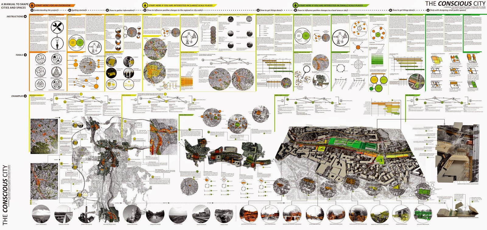
On the flip
side is this project by Plymouth University Master of Architecture
students in 2014 (plymarch.wordpress.com).

This project was to be a proposal for the
regeneration of a bus and train station on the Polish side of Cieszyn
City. This student team went far beyond
the scope of the project and produced a manual (top portion of board) to aid
understanding and to provide tools for the residents of Cieszyn to use in planning
the development of the region, city, and local areas.
The project
includes a wide variety of process, data, analysis, and intervention visuals
which are very effective and understandable and the manual information is well
organized. But overall there is far too much information and it is very
difficult to find the story. Visually it
is all so overwhelming and lacks a sense of hierarchy so that one’s eyes cannot
find a place to focus. It would have
been better to limit the board presentation to the site analysis and
intervention and put the additional information in an actual booklet.
The third
project is by a team of 5th year Landscape Architecture and
Architecture students in an urban studio in 2013 (wordpress.philau.edu).

The focus of
the project was on research and design of an eco-district framework plan for the
community of Germantown. The team vision
statement was: “To sew the
neighborhoods of Germantown through a system of pedestrian oriented green
thoroughfares that enhance the quality of life, strengthen the commercial
corridor and provide access to parks and green spaces.”
The presentation
includes area photos and mapped layers of analysis, vision imagery, intervention
concept models, and limited text. Overall, the story is easy to read through the
analysis and vision but the intervention models are squished up and a little
confusing because the perspective image is not oriented the same direction as
the plan views. The stacked map layers
at the left are redundant and could be removed to give more room for the
intervention to read easier. Also, the analysis images are bigger scale than
the design model so they are reading as more important than the design.
This
exercise analyzing the strengths and weaknesses of these three projects has
helped me see how important the visual communication is in storytelling and the
presentation of projects. I feel this is
a weakness in my own project presentations so, hopefully, I can now apply some of the effective techniques (clean graphics with visual space) in these examples and avoid the bad ones (too much/too little information, inappropriate hierarchy/scale).

Two years ago, my secular study into the History of Architecture. This lead to my understanding of current movements in History. We no longer rely simply on dates and `brief, vague facts.' What is more important to contemporary historians, is how they convey the importance of the period, the relevance of the event. To do so, their thinking is that the most important aspect is the dialogue, the ability of a person to grasp the importance through the story. To communicate. In this posting, you have provided a visual story which fills in the blanks created simply by words.
ReplyDeleteken